We realized it was time for a change when our old logo kept showing up as the recycling symbol on our shampoo bottles and food wrappers. Here at Project Gaia, we are continually adapting to best serve families around the world. Since our founding in 1995, we’ve gone from a research group to an implementing organization, and our projects have spanned several continents and numerous countries. Despite the ever building momentum at PGI, our logo and website have remained stagnant. Last year, we decided that we needed to modernize, and that it was high time to have our web identity reflect the work and positive change we generate around the world. Many thanks to Collin Arnold for capturing our work and identity and creating a modern, sleek and visually pleasing logo!
Since we try to funnel as much of our funds into projects as possible, we agreed that we would take on the project in house. This turned out to be a much bigger task than any of us expected. All copywriting, photo-editing, photography, and design direction are a compilation of the Project Gaia team’s vision. Of course, we could not have done this without the help of some wonderful designers and developers. In particular, we’d like to thank Peter Sorensen whose website development talent made it all possible.
With all this change, we’d like to point out some highlights:
- The Projects page houses all of our projects. They can be explored by country or by the type of work we do. These will be updated frequently to feature successes and spotlight new projects.
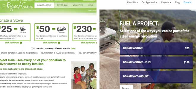
- The Donate page allows our supporters to donate the way they want. You can donate a stove, give directly to a project in need, share any amount you wish, choose AmazonSmile when shopping online, or become a partner.
- Since our old website was last updated, we have hired on a lot of new talent in all three organizations. On Our Team page you can meet our new staff as well as the experts that have been with PGI and our sister organizations for years.
- The Blog will allow us to update our followers and donors much more often on the work they are supporting.
- Our Solution Page shares our unique approach through a dynamic infographic to solving the problem of dirty, polluting fuels. Many thanks to Lacey Olson for designing these informative and fun graphics.
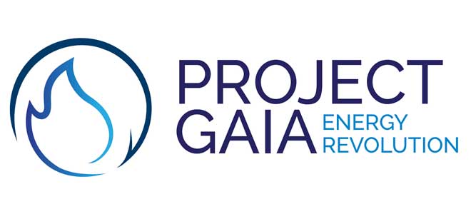
- After many iterations, we finally arrived at the perfect Logo. Blue represents the color of a clean, hot alcohol flame. The circular arrow demonstrates the sustainability of our projects, and the flame at the center represents the centrality of alcohol fuels to our work.
We hope you’ll visit this new site often to stay up-to-date on the momentum and changes always happening at Project Gaia. And, as always, we’ll continue to strive to bring clean energy to families everywhere.